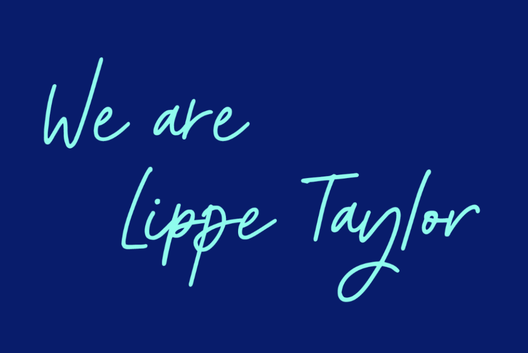
Lippe Taylor: Brand strategy, identity + brand launch
The situation:
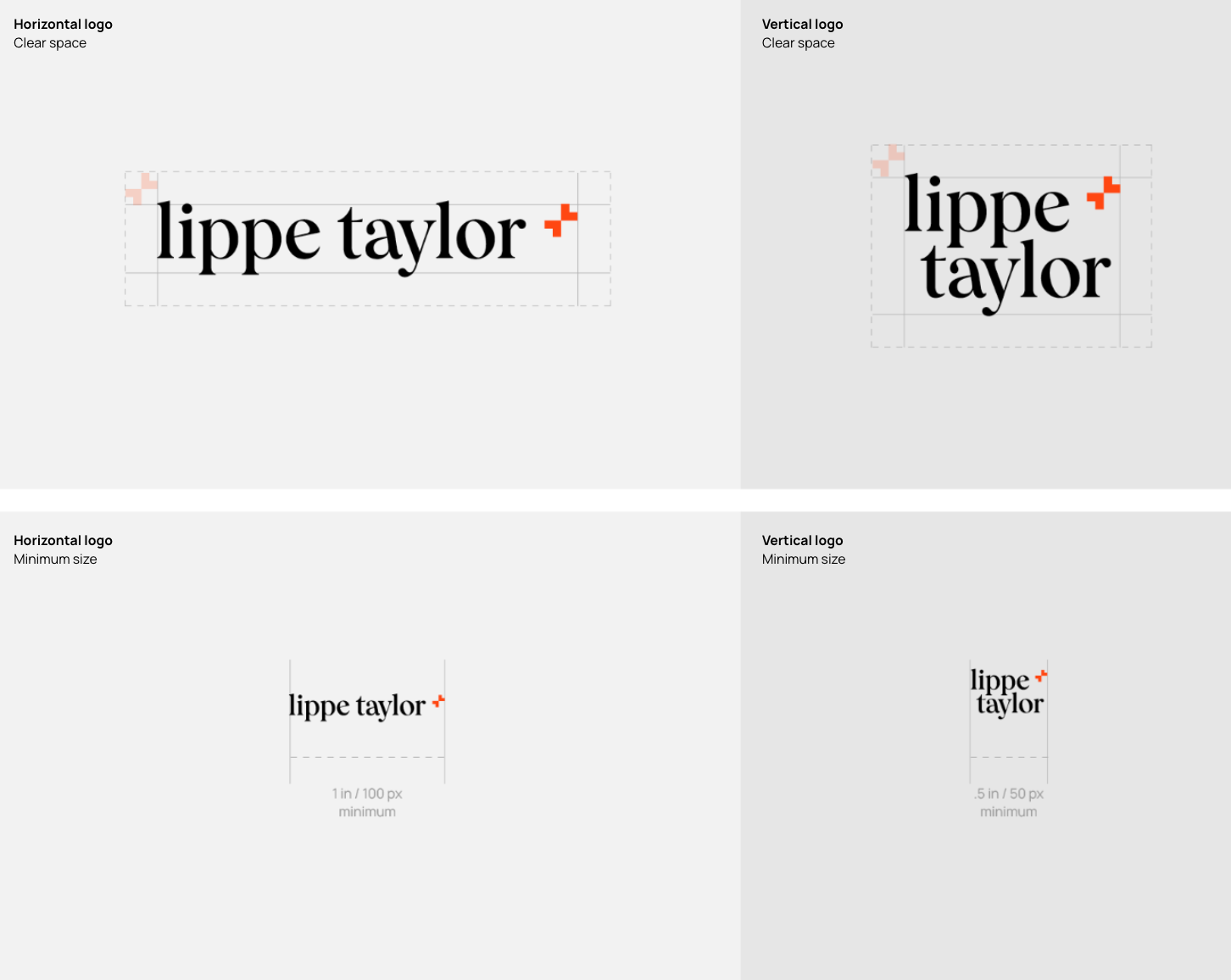
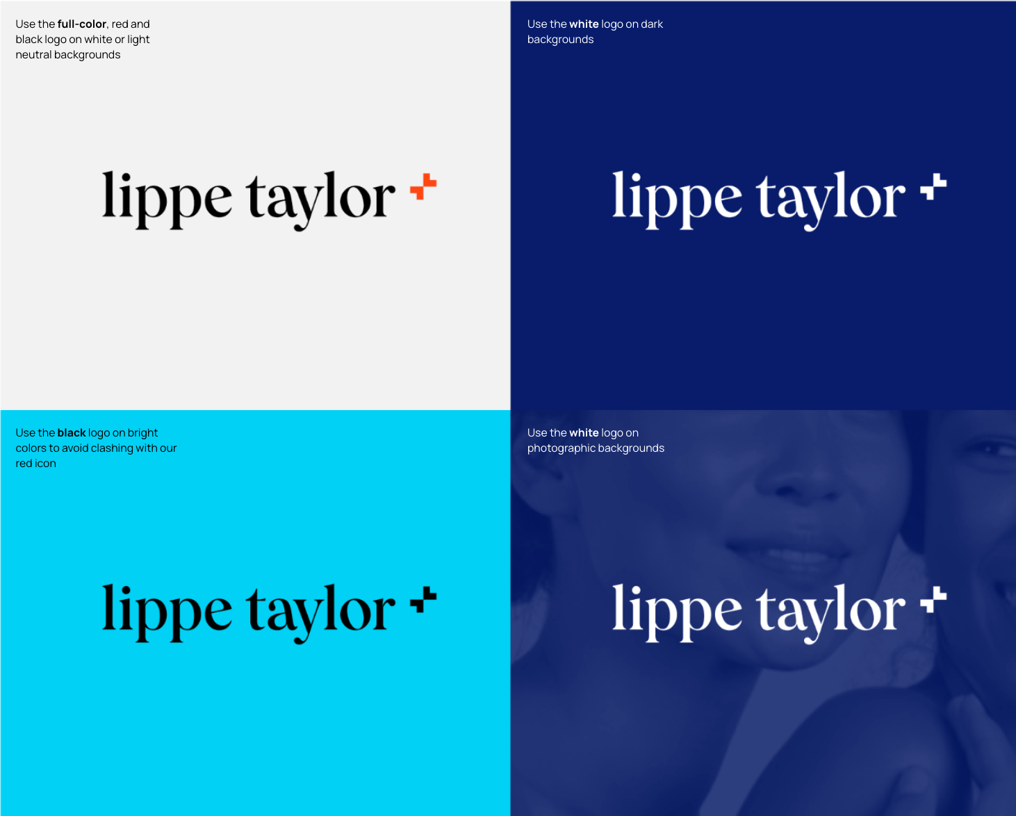
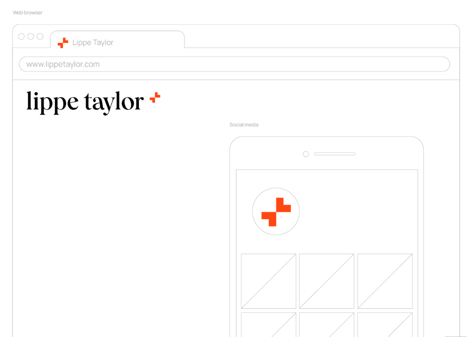
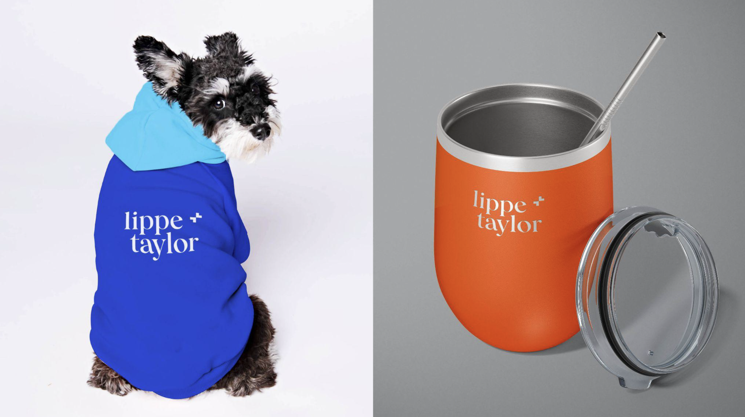
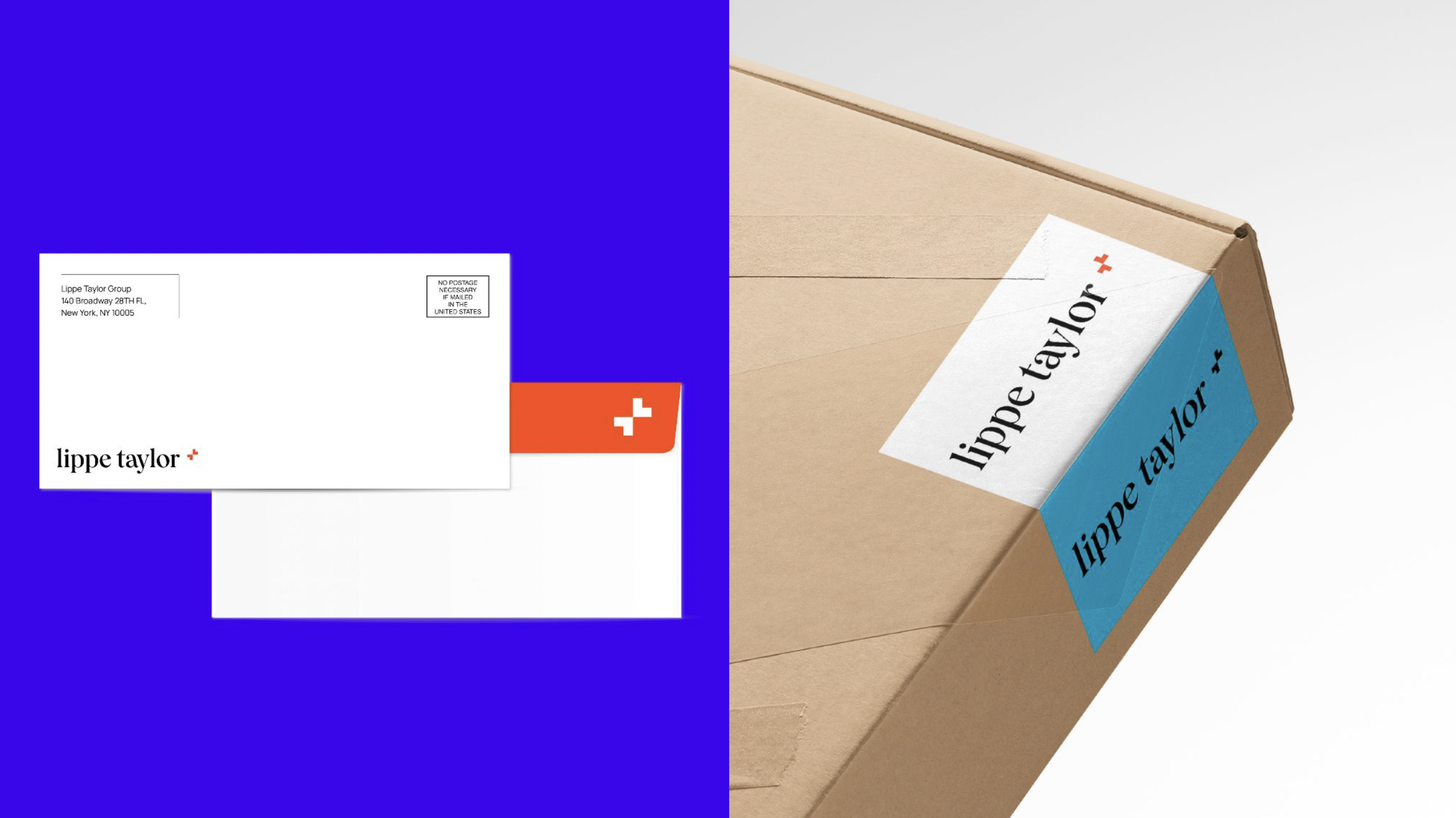
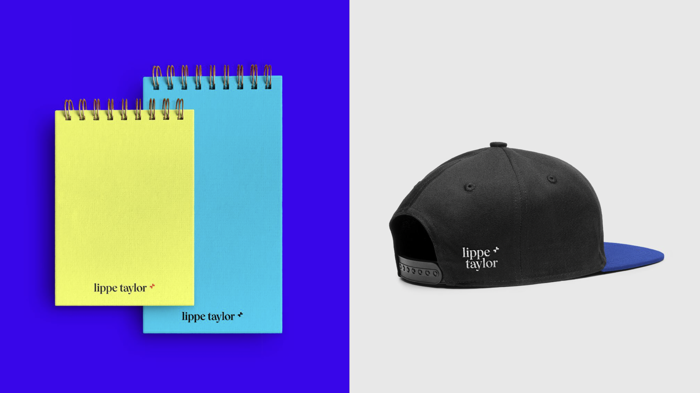
Lippe Taylor Group needed a brand refresh for its more central agency, Lippe Taylor. The agency has been around for 30 years, and the brand strategy, as well as execution, were showing its age. With the goal in mind of keeping some of its known and classic branding (the use of red and black), we needed to refresh the look and feel for it to work well in all formats and to help continue to evolve the perception of moving from a PR shop to an integrated agency with many offerings. The new brand logo also incorporates the “plus model,” central to Lippe Taylor’s belief system. It signals that to succeed, we need profound practitioners and people with widespread knowledge, combining to create the most favorable outcome. This mark can be used alone as an icon and part of the logomark, giving the brand a flexible system.
The execution:
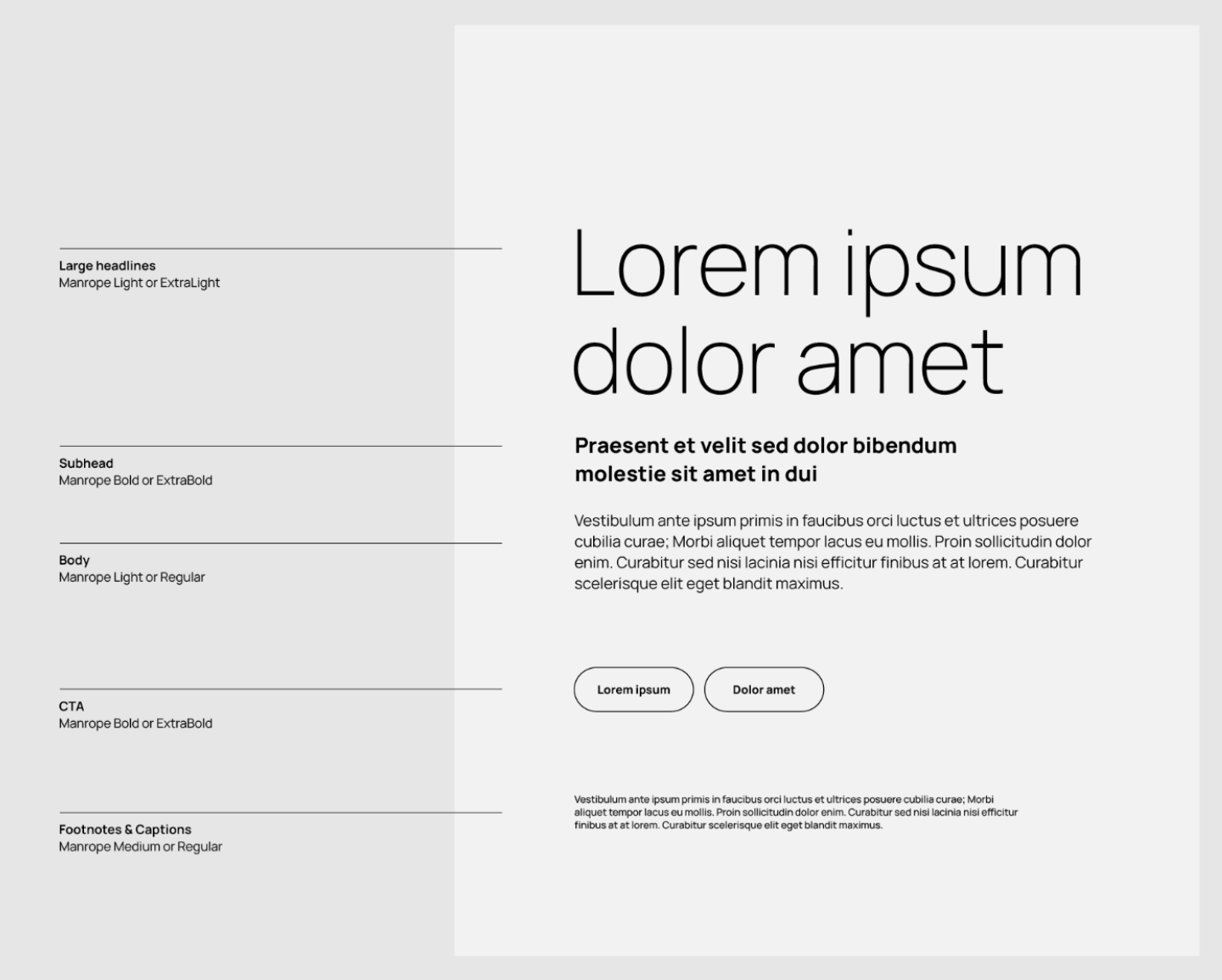
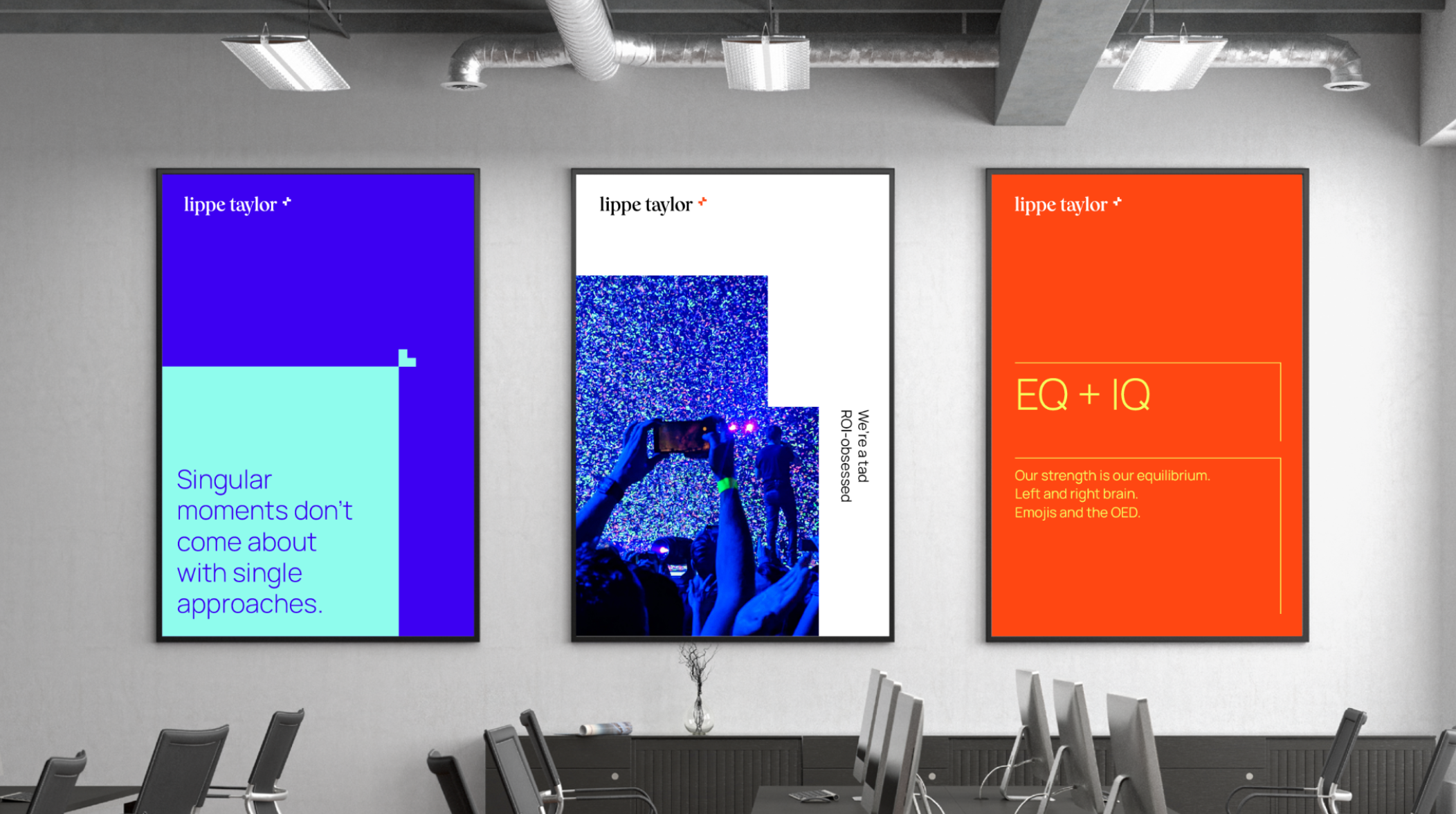
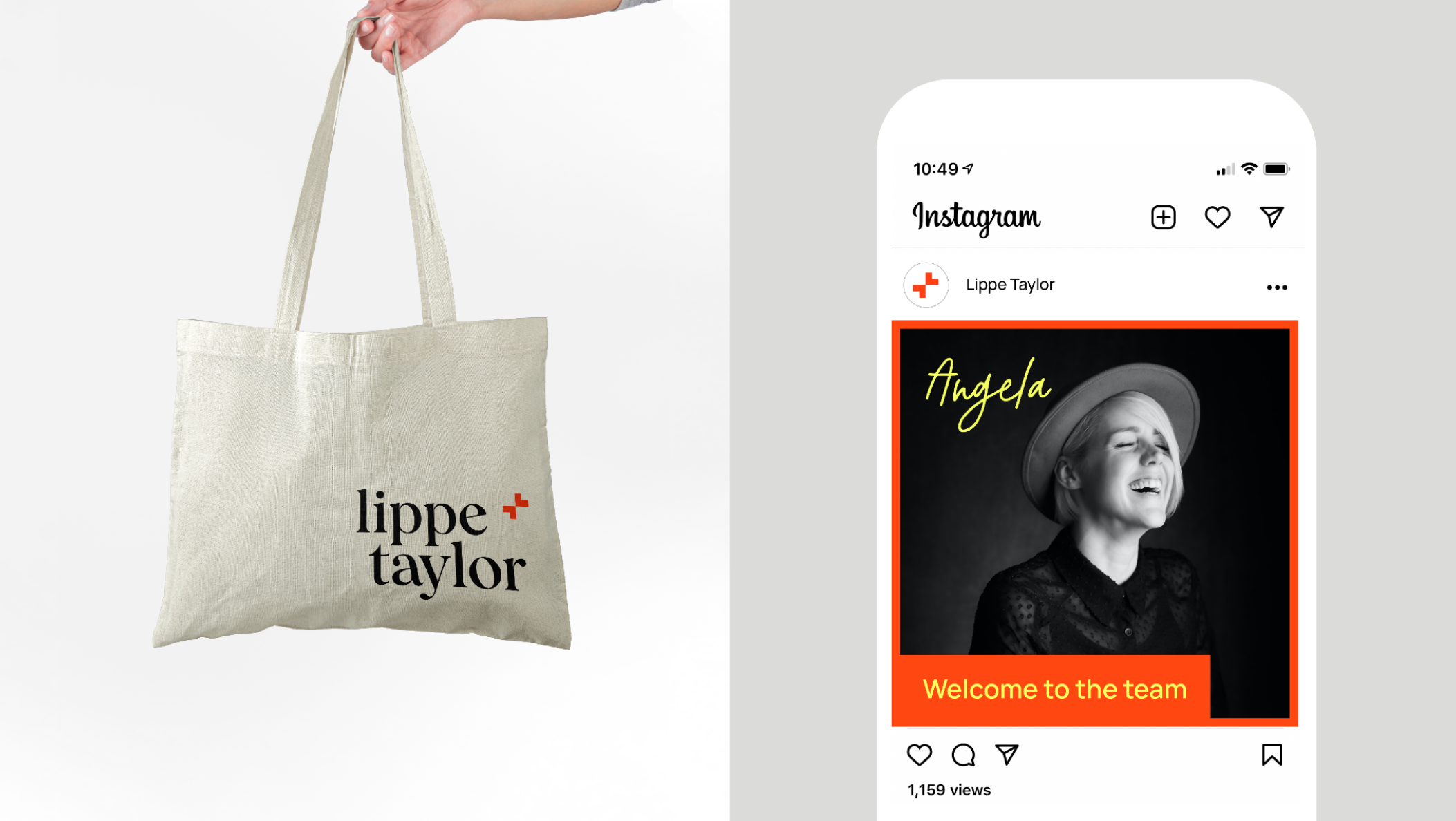
Complete brand strategy and positioning, identity system, and all materials needed for the brand at launch. This includes a new website, social media content, sales and marketing materials, packaging, and patient materials.


